by Kounan Kuwahara
Japan Educational Calligraphy Federation
1. KANJI IS A HIEROGLYPH
Letters or characters are means of conveying one’s thought to the others. In the Orient, they exist as media to express one’s heart directly to someone else’s rather than being only signs to state words. In a case of Kanji (Chinese character used in Japan also), it does not have to be first pronounced in the process of understanding its meaning. Just looking at a character is enough to understand the meaning. There is no need to be pronounced and then translated.
For instance, the character![]() (yama – mountain) is modeled after. You catch what is means at the first glance without pronouncing “yama”. And since this character is not a phonetic letter, it is applied in several ways with different pronounciation like
(yama – mountain) is modeled after. You catch what is means at the first glance without pronouncing “yama”. And since this character is not a phonetic letter, it is applied in several ways with different pronounciation like ![]() ”Fuji no Yama”,
”Fuji no Yama”, ![]() ”Fuji-San”,
”Fuji-San”, ![]() “Hiei-Zan”,
“Hiei-Zan”, ![]() “Shumi-Sen”,
“Shumi-Sen”, ![]() “Ryou-Zen”.
“Ryou-Zen”.
Because each character is a word of itself, the characters are quite numerous. In present-day Japan, the characters commonly used amount to some 3,000, of which some 900 are taught to primary school children. It may look to a foreign eye that the practice of all these characters cause a great complication in Japanese life and that the difficulties with which children learn them is tremendous. But as a matter of fact, it is not quite so. Because the characters are words of themselves and Kanji is not a “character to read” but a “character to look at and understand”.
2. SELF-EXPLANATORY CHARACTER
“To look at and understand” means one makes oneself understood by others by heart. “To read” is a scientific intercommunication, wheras “to look at and understand” an artistic one. Scientific character-life and artistic one co-exist in the Japanese character-life. “Shodo” or calligraphy is this artistic character-life enhanced to a pure art. Therefore the art of calligraphy is learned, enjoyed, and regarded as a part of culture by every Japanese.
3. FIVE STYLES OF KANJI
Each of the Kanji that are almost as many as the words is represented in various styles. In common writing are applied “KAI-SHO” style in which every “TENKAKU” (the lines of different length and angles that form a character) is faithfully reproduced without any omission and “GYOU-SHO” style in which “TENKAKU” are not necessarily faithfully followed and written quickly. When particular civility and beauty are desired, we employ the ancient “TEN-SHO” and “REI-SHO” styles. To write quickly is employed “SOU-SHO” style which is extremely cursive with “TENKAKU”. TEN-SHO”, “REI-SHO” and “SOU-SHO”… are practiced only by calligrapher scholars and professional calligraphers (calligraphy artists).
Although these styles are a bit unfamiliar to the common people, they still recognize to a certain degree the characters written in these styles. And even when they do not recognize what the characters are at least they appreciate the elegance, and enjoy the beauty of the character as a part of their life.
4. ILLUSTRATION OF THE 5 STYLES
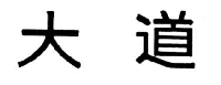
The first illustration is basic without movement or variation. Just lifeless skeleton.
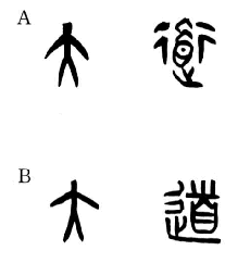
1 – Now, when calligraphed, they look like this: The action of calligraphing gives TENKAKU variation through the natural reason, and brings the Kanji to vivid life in their graceful figures. The Kanji wear vidid and austere expression. This style is employed when we want to write carefully and precisely. It is called “KAI-SHO” and is taught at school.
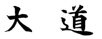
2 – When we actually calligraph the brush is manipulated quickly enough to result in this much cursiveness, but not wildly deviated from the basic form. The sizes of characters are not identical, either. This style is called “GYOU-SHO”.
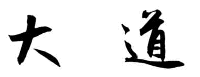
3 – This style is done with prompt and light stroke of brush and is meant to calligraphy Kanji for the designized floridity and beauty. However, the difference from the merely designized letters is this: In this style, the keynote is the beauty of movement formed by the action of calligraphing. In this case, Kanji must have vivid life. This style is called “REI-SHO”.
4 –
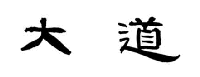
(A) is completely deviated from the basic form. This will not be easily understood by the common people. This is the original style when the characters were created. This style is called “KOBUN”.
In the course of some 1,000 years time these Kanji went through transformation and came to be represented as (B). This is called “SHOU-TEN” style. Most everybody would be able to recognize these Kanji. This style is generally called “TEN-SHO”. Even today “TEN-SHO” is used in signboards, titles, monuments and seals. The calligraphy artists love this style for its elegant figures and use it in their work of artistic expression.
5 – This is also a deviation from the basic and is used by the cultured among the common people. This style is not only handy for rapid writing but also rich in the variation of figure. The manipulation of brush is so free and unrestricted that this style is becoming calligraphy art. However, special knowledge in proper abridgement of Kanji is required as well as well-skilled technique in calligraphy. Up till Meiji era (ca. 100 years ago), the Japanese in general used this style in daily writing. It is called “SOU-SHO” style.
Above mentioned 1-5 are the description of “GO-TAI” or five styles of Kanji.
5. KANA CALLIGRAPHY
Today in Japan, we mix Kanji and Kana for writing sentences. Kanji are the characters imported from the China continent whereas Kana were created in Japan. The former is hieroglyphic, the latter phonetic letters. The main words that compose a sentence like noun, verb, adverb and adjective are represented with Kanji and the auxiliary words like auxiliary verb, conjunction are often represented with Kana. Unlike Kanji which is a word at the same time it requires a few Kana to form a word. This use of the two series of heterogeneous characters and letters is not necessarily suitable for the expression of calligraphy art. There have been researches being carried out on the mixed expression of calligraphy of both these heterogeneous characters and letters. However as far as the calligraphy art expression is concerned, it is preferred to calligraphy Kanji and Kana entirely seperate because of the uniformity effects.
Kana are not phonetic signs, but phonetic letters. They are not mere tools to show sounds. In the process of Kana’s development, the keynote has been the artistic nature to convey one’s heart in an esthetic manner to another just like the case of Kanji. The belief of the medieval Japanese that the letter-life is one of letter art gave birth to the Kana calligraphy. The art of letters consists in the variation of well-balanced figures, and in the richness of action that accords with the laws of nature. Since several letters of Kana are needed to represent one word Kana are inevitably written down continuously. The beauty of motion in Kana calligraphy has developed to reach to the stage of beauty of flow. The free and fluent motion is worked on the sheet which rhythmically develops into well balanced variation of figures. This has established the peculiar Kana calligraphy art. Because Kana are no tools of phonetic signs but are medium of artistic expressions, there many forms available to represent a sound and upon writing, one can choose the most desirable letters to use in accordance with the variation and harmony, considering the counter balance up and down, left and right, as well as the natural movement of the brush.
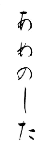
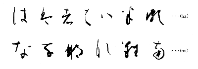
(1) These are letters simply placed in order.
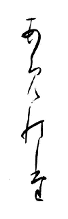
(2) Though written down continuously, dull with repetition of the same type of figures.
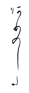
(3) The repetition of similar looking letters is avoided when written this way, still the variation in direction is not enough yet.
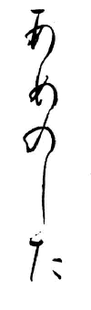
(4) When these letters are chosen, the expression becomes consistent and fluent in figure. The repetition of the same figure can be avoided, too.
Please compare these four examples to help understanding what Kana calligraphy is.
6. WHAT TYPE OF AN ART IS “CALLIGRAPHY”?
Calligraphy is an art of lines and has for its material characters and letters. However, not every character or letter of the world’s nation is applicable. Coded letters are hard to handle in calligraphy. Kanji and Kana that are best developed to suit the artistic expression are the most ideal materials. To write characters naturally involves the significance of what is written. The characters that deserve being appreciated as an art object would like to be phrases that are worth being appreciated. Philosophical, literary or instructive phrases, etc. Further, the significance of the words and the figures of the characters should not be too discrepant from each other. A mild characterexpression for a beautiful poem, a sturdy one for powerful words.
The work of calligraphy is sometimes regarded as a plane formation art. This is not right. The result composed on the sheet might look like a special formation, but what decide the art of calligraphy is, as I earlier mentioned several times, the action of calligraphing and the temporal motion. Therefore there are two important elements: pictorial composition and the musical liquidity. A calligraphy work is trace of the brush marked as graduation on the sheet by a series of motion from the moment the brush touched the sheet up to the finishing touch. The calligraphing motion is a cubic one. The soft tip of a calligraphing brush can record the cubic motion just as it is. Sinking or lifting the brush create richly varied lines which is an expression of different degrees of cubic pressure worked on the brush.
Since the calligraphing is a cross-section of this cubic motion marked on the sheet, it can not be called but in fact is cubic image. This analysis will indicate that calligraphy art is something quite different from painting. Speed and pressure are the two important factors that characterize calligraphy lines and the interlacing of these two brings forth unlimited variation.
7. THE ELEMENTS OF “BEAUTY” IN CALLIGRAPHY WORKS
(1) Composition
1. The figure of each character.
2. Direction, thickness, and strength of TENKAKU.
3. Harmony of numerous characters.
4. Total composition, allocation of characters.
5. Margin left.
6. Character composition in accordance with the size and shape of the sheet.
(2) TENKAKU
1. Nature of lines (heavy, light, strong, soft, deep, shallow… )
2. Form of lines (thick, thin, long, short, straight, curved)
3.Position, direction and size of TENKAKU
(3) Motion of brush
1. Speed (slow, fast)
2. Pressure (light, heavy)
3. Rhythm (HISSETSU brushwork effect, length of one stroke)
4. Order
(4) Chinese Ink Colour
1. Thick, light
2. Ample, scarce
3. Gather and disperse
(5) Blank Space
1. Allocation (balance in the sheet)
2. SHOUHOU (how to place margin)
3. Expression in compliance with the shape and size of the paper
4. Expression considering the texture, colour and ground pattern of paper.
8. EPILOGUE
Calligraphy is not an art of technique but an art of mind. In a word, a piece of work should be judged not only by the result but also by the movement of brush, the progress and the attitude of calligrapher that are observed through the work.
A beautiful calligraphy must have a fine movement of brush in accordance with a upright character figure.